


But I butchered Helm's beautiful logo by making it too "stretchy". (Update: Helm sent me a better stretchy version, God bless him, which is now serving as the temporary I.C. header.) It should look like this:

...Or this:
Anyway, I'm no graphic designer (this will come as no surprise to readers of this blog), and I really wish I could design a new header that would do this blog justice. Which got me to thinking: There are plenty of talented folks out there reading this, let's make it interesting. Past graphic-design contests returned epic results, so why not open it up again? I want to see your take on what the I.C. header image should be, and the winner will have their entry displayed at the top of this page, all the time, forever (or until I get tired of it). I like the idea of juxtaposing the Large Hadron Collider with the phrase "illogical contraption", but I'm sorta tired of looking at that thing. Fantasy, metal, horror, mythology, and sci-fi are all parts of this blog, so anything along those lines would work. And it should probably be somewhere in the 1000/1200 x 300/400 pixel range to look right. And that's about it. YOU get published on one of the most popular blogs in THE WORLD, and I get free labor. EVERYONE WINS!
As usual, mail your entries to illogicalcontraption@yahoo.com. And download Helm's original, hi-res, black-on-white version of the logo here.
Here are a couple of shitty attempts I made at creating new headers -- Like I said, I'm no graphic designer, but maybe they'll help get the juices flowing:
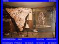
Too "fantasy". Also, too tall:

Too "gamer":

Too simple/stupid:

Too, um... Something.

So get on it! Don't pretend like you've got anything else to do this weekend. All entries will be published, and although I *lied about the sandwich, I will send the winner free copies of both the CRETACEOUS and DALTON CD's (as soon as they're done). We'll keep the contest open until... Halloween. OK? AWESOME!
Any questions?


6 comments:
Hey, good luck with the contest. Until then however, he's a few thoughts on how to integrate better.
Your header image is 820x375 pixels, right? So if you're going to overlay the logo on top of an image, do it within such a selection.
For example going with the Valyria image:
www.locustleaves.com/vvv.png
This is easily done by taking the logo in a new layer in photoshop on top of the art, resizing it as you see fit ( hit CTRL+T to transform an image and be sure to resize while holding down the SHIFT key, so it keeps the aspect ratio!) and then setting the layer blend mode from 'Normal' to 'Multiply'.
If you want it white on top of the art, then Inverse the colors in the logo layer (it's under the Adjustments menu somewhere) and set the blend mode to screen. The result would be something like this:
www.locustleaves.com/vvv2.png
Also every layer has blend mode options (right click on a layer) but that's a bit more advanced and can result in pretty horrifying end art if not used sensibly. Here's another idea using blend modes and setting the logo to use an alpha layer so it's not dependent on the Multiply mode (simpler than it sounds, just go to the big logo image file I gave you that is just black and white bitmap. 1. Promote the background to a layer, 2. select a white pixel or more 3. go under Selection menu and choose 'select similar' 4. press delete on your keyboard et voila, you now have a black logo without any white background to copy-paste on top of any art and mess around with blending options.
Never too late to learn photoshop more!
http://www.locustleaves.com/vvv3.png
Also if you end up using a stretchy version, use this:
www.locustleaves.com/illogicalcontraption_stretched.png
though I really don't suggest it.
Yeah I did that shit on the fly, I have an extremely basic knowledge of only GIMP and MS Paint and no eye for design, so I'm hoping someone else will come through (it's worked before!). I'll definitely look into this stuff and check out Photoshop a bit more. I gots no time tonight, but maybe I'll hit it up tomorrow. Something will work out.
Valkyries don't need saddles to ride war-stallions.
Yeah! That new logo is awesome, and I think it works great as it is. But, if we have to change it, we should bust out the photoshop spray paint can and tag it up with purple and green and red. This will give the blog a much-needed urban flavor, and hopefully draw the coveted b-boy demographic. Fresh.
Wow great! thanks for taking my advice.
Now I might be able to finally reveal my TRUE identity mwoehaha
Post a Comment