Showing posts with label Waste of Time. Show all posts

Thursday, January 17, 2013

APOCRYPHON SPRING DATES 2013


- THURSDAY, MARCH 21ST, @ DNA LOUNGE, SAN FRANCISCO
W/ LANDMINE MARATHON
MAN AMONG WOLVES
AT OUR HEELS

- FRIDAY, MARCH 29TH, @ ON THE Y, SACRAMENTO
W/ FACINOROUS
FIENDS AT FEAST
EMBODIED TORMENT
FALL OF MAN

- SATURDAY, MARCH 30TH @ JOHNNY V'S, SAN JOSE
W/ CYANIC
FIENDS AT FEAST
+1 MORE TBA

- FRIDAY, APRIL 12TH @ HEMLOCK, SAN FRANCISCO
W/ HAZZARD'S CURE
NECROT

- FRIDAY, APRIL 26TH-SATURDAY, APRIL 27TH: "FESTUM CARNIS", SODA SPRINGS, CA
W/ ABSU (!!!)
GRAVEHILL/WITCHAVEN/NOCTURNAL FEAR
NUCLEAR DESECRATION/VALDUR/HELLHUNTER
BADR VOGU/MINENWERFER/ROTTEN FUNERAL
NIGHT NURSE/BLACK FUCKING CANCER/HUMAN FILTH
VILE MASS/CYANIC/BLASPHEMOUS CREATION
TEMPLE OF DAGON/MALEFICUS/HELLBOMBER
HEMOTOXIN/XENOTAPH/DEMON SEED
VALLEY OF THORNS/ARCHEA/ More TBA...

- THURSDAY, MAY 2ND @ THE SHANTY, EUREKA, CA
W/ BANDS TBA

- FRIDAY, MAY 3RD IN SEATTLE, WA
VENUE AND BANDS TBA

- SATURDAY, MAY 4TH @ ASH STREET SALOON, PORTLAND, OR
W/ BANDS TBA

Split album (+ vinyl!) and new shirts on the way soon! Catch updates via Apocryphon's Facebook page...


PS: ILLOGICAL CONTRAPTION IS NOT DEAD. Complete re-design and re-launch coming in the very near future! Any and all brogrammers, artists, writers, or other assorted freaks looking to toil under the IllCon banner for little or no reward (especially brogrammers) write to Cobras at illogicalcontraption(at)yahoo(dot)com. ALL I ASK IS THAT YOU OBEY ME AND I WILL BE YOUR SLAVE.


Monday, August 6, 2012

When drawing goes wrong pt3. Photoshop abortions.

During the previous two installments, here and here, it gradually became apparent that even amongst the bad album artwork that plagues the Internet and peoples music collections there are even worse examples of dreadful artistic vision and crap delivery. Previous posts concentrated on art that was in the most part actually drawn/painted/dribbled out by someone. They might not have had much of a idea about anatomy or have ever seen a women naked but they at least possess, in the loosest sense, charm.
Tonight's post deals with those most heinous of culprits when it comes to bad album artwork. The Photoshop abortions. Your technology can't save you.

To kicks things off, IllCon follower SoulReaper recommended this blinding piece of ham fisted photo shopping nonsense. Dismal Euphony....dismal euphotoshoppy. Sorry.


This was always one of the first things that came into my head whenever anyone mentioned bad photo-shopping. You have all manner of tools at your disposal  yet you can't even get the lower jaw of a skull right!


Not content with making it look like some pre-1997 PC game art they just go and use the most basic, default font.


You'll never get anything started slacking off like that Mr Speckmann.


Another example of not only being dreadful ( I mean look at it!) but knocked even more for having a bog standard font. Plus, a dreadful album title.


I can wager that if this image, an angel being defeated and having its life force sucked out by a demon inside a church, had been hand drawn and coloured I would probably have thought it pretty cool. Sadly someone got to it with Photoshop first.


If ever a single image summed up the plight of the regular IllCon follower then this album cover is it.


I like Benediction. I don't like this artwork. 


I still haven't been able to work out if this band are a joke or not. I could only get about 20 seconds into this video. This artwork and album title certainly suggest its all a joke.


The soft-porn/1997 "adult" PC game vibe was perfectly nailed on these two covers by everyone's favourite band we all claim not to like.


German engineering perfection. No.


Another example of quality band let down by PS1 quality artwork. it doesn't really fit.


You send something off to the printers, you send it at the right resolution don't you. I have been aware of this one for ages but I never knew the actual band name, I still don't.


Not often do tasteless album title/artwork concepts combine with bad Photoshop. But when they do the results are pretty special.


I can spot a circular saw, cyborg eyes, pink hair, robotic boobs and what looks like parts of a motorcycle. its not a magic eye image either.


Its like the cheap version of a Minotaur. A bemused armadillo. Doesn't really chase you round the maze. Just sits there looking confused.


Hypocrisy have quite a few probable entries lurking in that back catalogue of theirs. Funnily enough nearly most of it has been reissued in recent years with different artwork. I'd like to think that's because they looked back in horror at the below image.


To top it off is the one that got mentioned the most in past correspondence. Iron Maiden have done many great things for metal but this artwork certainly wasn't one of them. In my research I came across a story about how this was originally a mock up of the concept. The band saw it and decided to use it. Maybe save a bit of money. It may be true it may not be, it does sound like something you would say after many years of reflection and you slowly come to the realisation of how lame your album art is. I always like to think that Iron Maiden don't really need to go near computer technology. keep the two separate. Ed Hunter was bad enough.


Once again I will leave it up to you guys to let me know if there are any that deserve inclusion? In all fairness I spent quite a bit of time trawling the Nuclear Blast, Spinefarm and Roadrunner back catalogues and its almost another full post on some of the lame art those guys have hidden away.

Friday, June 1, 2012

When drawing goes wrong pt2.

I am going to put it out there and say that it was pretty sweet seeing the level of response to the previous bad artwork post. Then the remedial prison, rehabilitation art ball rolled into the MS Paint album covers post, which we all agree was beyond awesome. To quote the head honcho, " we have the best goddamn motherfucking readers on the entire Internet, you guys rule."
On that slushy note, here is another selection of some of my favourite "bad art" album covers. Once again. Despite a complete lack of art skill and in some cases complete lack of human anatomy, I do hold a certain level of respect for these awesome images.


Pretty obvious what these guys think about all the time isn't it? I can wager it isn't being in a band.


God bless the Scorpions for consistently proving themselves to be guitar wielding numb skulls of the highest order. I have a slight bit of respect for the German chumps over the fact that when it comes to making some sort of statement, The Scorpions are always going to express it at a unbelievably low level of both class and awareness. With Animal Magnetism they surpassed themselves and wouldn't manage to beat it until 1996 when they hit us with this guy.....


See what I mean, deep stuff.


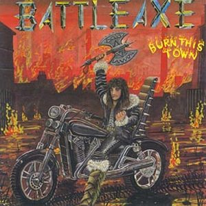
Future barbarian, biker, outlaw judge? Who knows but Battle Axe. They charged into the art the same way they approach they're sweet metal jams. With more enthusiasm than skill.


I really dig this one. Its just an awesome image. Plain and simple. Of course maybe the artist wasn't exactly up to the job but I am letting it slide.


It was mentioned last time so here it is. I never thought I would say this but Metal Magic really was a step up for these guys after Projects In The Jungle.


Karisma with a "K". Pretty sure that's a rabid walrus either escaping from some kind of imprisonment or just hanging out. Awesome.


Yes, that is a skull faced nudist raising a severed penis above its head atop a volcano. Thanks for noticing.


Everyones favourite NWOBHM never was's prove that you shouldn't fear evil. Fear death and badly drawn skulls instead.


Some evil, Christ baiting black metal? No? Oh sorry my mistake. You look like your having far to much fun at camp to be actual black metallers. She most certainly is having far to much fun streaking for Satan.


You shouldn't really expect too much when diving into the putrid trough of goregrind/pornogrind nonsense, its meant to be offensive. But this certainly plumbs some stinky depths.


Another one mentioned last time and its a cracker. Really what can you say about this? 
Once again, Any of you guys want to throw some more into the ring? We are open to suggestions for any you can think of to top these.

Thursday, May 10, 2012

Further Down the Rabbit Hole of SHIT: Counting Crows Fan Art

So hey. The death of music blogs is upon us. It's inevitable that Illogical Contraption will get shut down eventually by the evil record companies. In light of these recent Nazi-esque crackdowns we decided to become a full time fan art blog. Enjoy!


Thursday, April 26, 2012

The 6 Shittiest Little Brother Bands Of All Time

Being the little brother of an established rock star is a mixed blessing. Sure you can get more hype for your crap band but you will forever be in the shadow of the dickhead that kicked your ass when you were little. Here at Ill Con Labs we have been doing extensive research on the phenomena of little brother bands and we have come to this conclusion: THEY ARE ALL SHITTY.

Deep inside Ill Con LABS
Through many years of studying we can now bring you the definitive list of THE TOP SIX SHITTY LITTLE BROTHER BANDS EVER (after the jump)!

Saturday, April 21, 2012

When drawing goes wrong pt1

You may have seen those worst album cover lists going round on all the other, slightly less cool websites? Well I have been collecting my own bad album artwork for some time now and would like to present my findings in the first of not so often series. Despite a lot of these being anatomically incorrect I believe there is a certain charm present.


Its pretty easy to poke fun at metal art like this. Lets move on.


Bitches Sin showing a complete lack of respect for art history.


What makes this one so bad is the look of puzzlement on the barbarian's face. Or maybe its the sudden realisation of the situation he's in. Or the terrible font choice.


I spent 5 years at art college. The first lesson they ever taught us was that smudging is no substitute for shading. Druid's artist buddy obviously never attended art college.


I always feel bad about ragging on Pantera ( which I often do) but then I think of this cover and the feeling passes.


More recently we have this monstrosity. You would think with the obvious money this band have available for artwork and design they would try and avoid the "Amiga 500 game artwork" vibe the artist seemed to be going for.


I love Vision Of Disorder. But this cover still blows to this day. I have tried to work out what the theme was or how it links with the music. Always drawn a blank.


I sort of like this one. I don't know if its the homeless, crackhead criminal with his tattered shirt or the young lady enjoying the sunset unawares that does it for me.


This album actually contains some pretty sweet, pump up, montage-esque, Miami Vice jams. Sadly I don't know anyone that would want Russ Ballard leaping at them in 3D or even in real life. You didn't even get 3D glasses with it.


I can just imagine the brief for this one "The devil emerging from his cave/lava pit and trying to grab a flying horse." Pretty specific and I am pretty sure that's what they got by the look of this. This is actually my desktop background now.


Obviously there is nothing slightly wimpy about this cover other than the ink started running out as they where finishing the nude dude's torso shading.


All that is missing are the obvious lines on the A4 paper it was drawn on.


I had this written of as some terrible 7th generation nu-metal band going of this cover. Sadly, during this research I found out its a German Avenged Sevenfold covers band. I would like to think they have some concept of why a Werewolf is dressed like one of The Blues Brothers and running along the highway in the rain. But I really doubt that.


What makes this bad is the fact its got the Waking The Cadaver font at the top. Otherwise this would be a pretty sweet image. But the sudden association with terrible gore/slam/death malarky means it is relegated to bad artwork corner


Every one's favourite industrial elf surely knew this was a stinker from the get go. I don't know if this has any relation the the film/TV series of the same name or why he has chosen to show himself floating with a glowing aura. Completely unrelated, I remember hearing a story about Mortiis trying to hail a cab outside his record companies office when this album was out. They wouldn't stop so he was forced to walk the streets in full costume.

TO BE CONTINUED......